

Introduction
Choosing the right cabinet color can completely change how your kitchen feels. Cabinets cover a large part of the visual space, so even a small color shift can make the room look brighter, cleaner, larger, warmer, or more modern. If you want a kitchen update without a full renovation, repainting or refinishing cabinets is often one of the highest-impact upgrades you can make.
A useful fact to keep in mind: cabinets are one of the first things people notice in a kitchen, and they strongly influence whether the space feels updated. Also, lighter colors tend to reflect more light, which helps smaller kitchens feel more open, while darker tones can add depth and a premium, custom look when paired with good lighting.
Below are 20 kitchen cabinet color ideas for a fresh look, explained in clear terms with practical tips, best pairings, and where each one shines.
1) Classic White for a Bright, Clean Kitchen
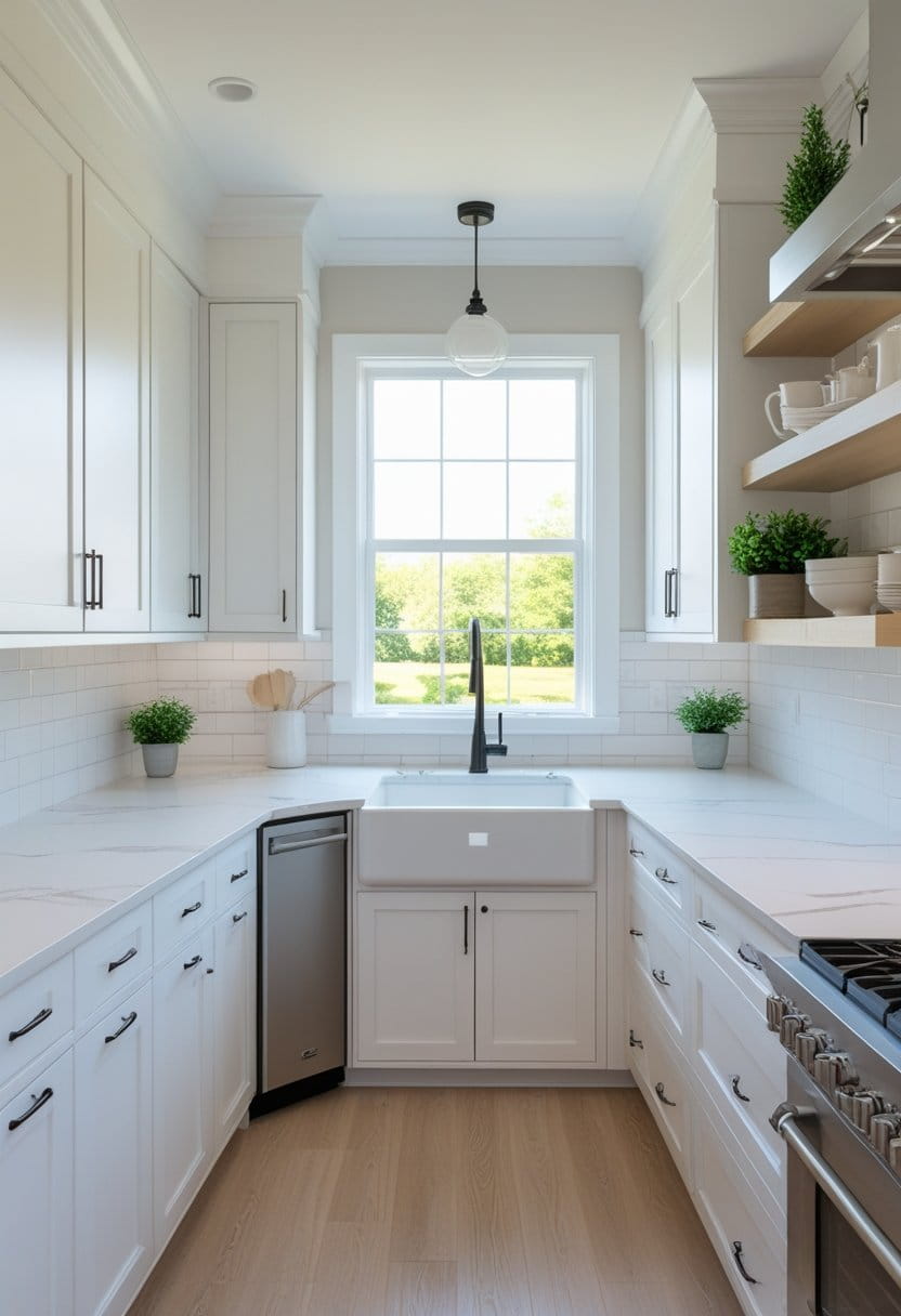
White cabinets are popular because they make most kitchens feel bigger and lighter. They also pair well with almost every countertop and backsplash style.
Best for: Small kitchens, low natural light, modern or farmhouse looks
Pairs well with:
- Marble-look counters
- Subway tile backsplash
- Matte black or brushed nickel hardware
Quick tip: Choose a slightly warm white if your kitchen feels cold or shadowy.
2) Warm Cream for a Soft, Welcoming Feel
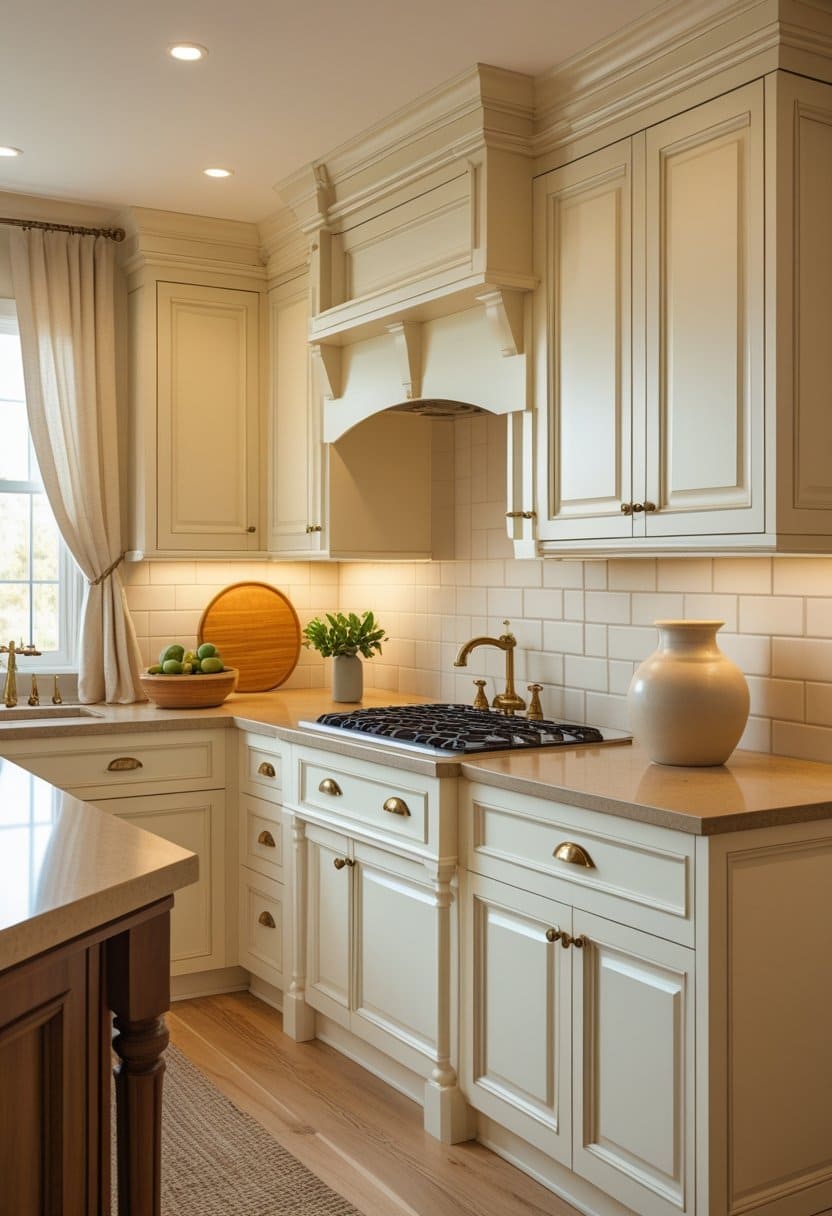
Cream gives you the brightness of white, but with more warmth. It feels comfortable, traditional, and easy on the eyes.
Best for: Cozy homes, traditional kitchens, warm lighting
Pairs well with:
- Wood floors
- Beige or tan stone counters
- Brass hardware
Quick tip: Cream looks best when your walls are not too yellow—keep surrounding tones balanced.
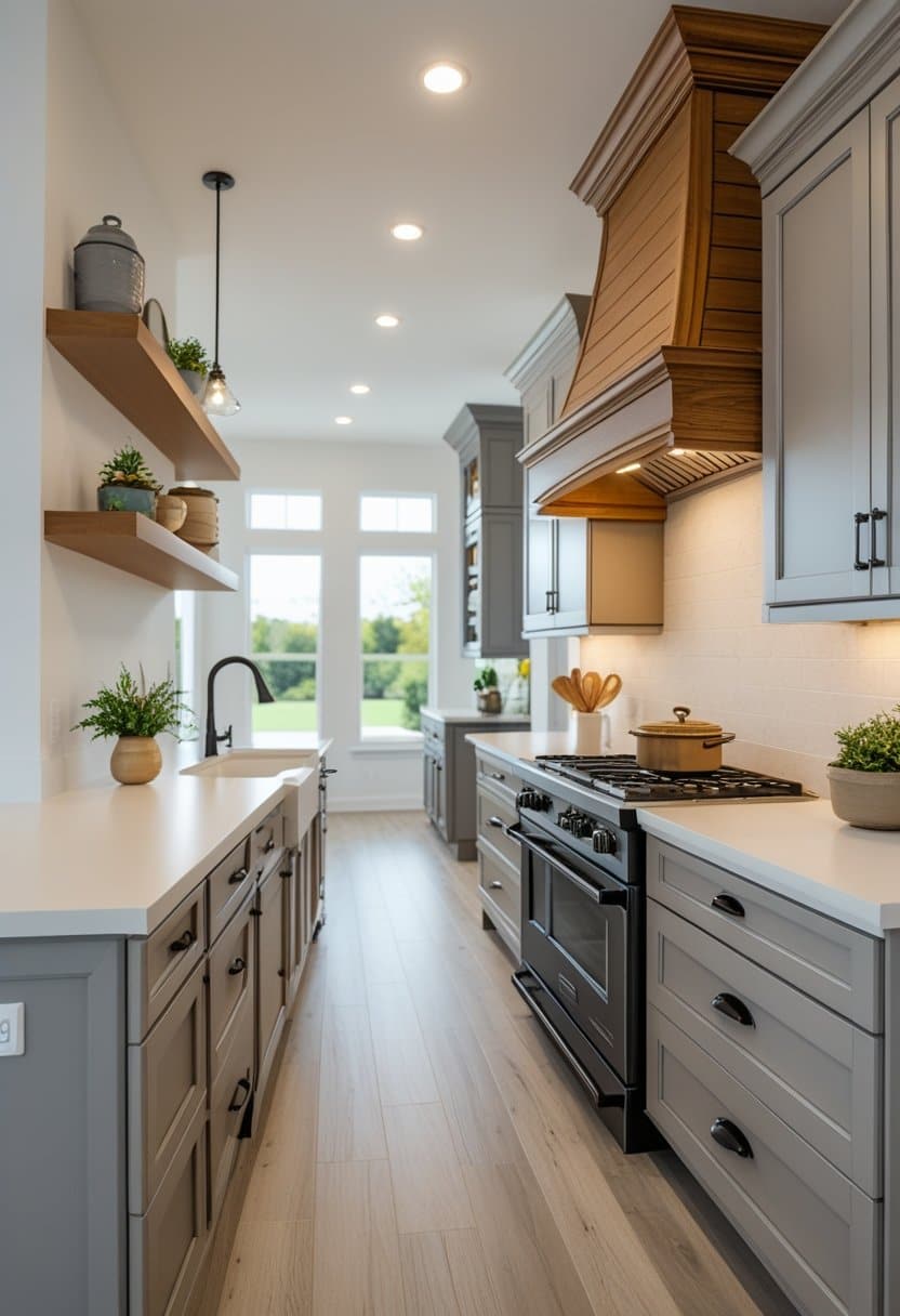
3) Light Gray for a Calm, Modern Neutral
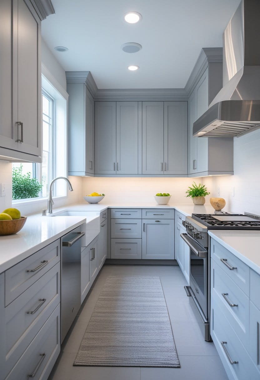
Light gray is a reliable choice when you want a clean look but not pure white. It adds gentle contrast while staying neutral.
Best for: Modern, transitional, minimalist kitchens
Pairs well with:
- White quartz counters
- Stainless steel appliances
- White or gray backsplash
Quick tip: Test gray in your lighting—some grays look blue or purple depending on bulbs and sunlight.
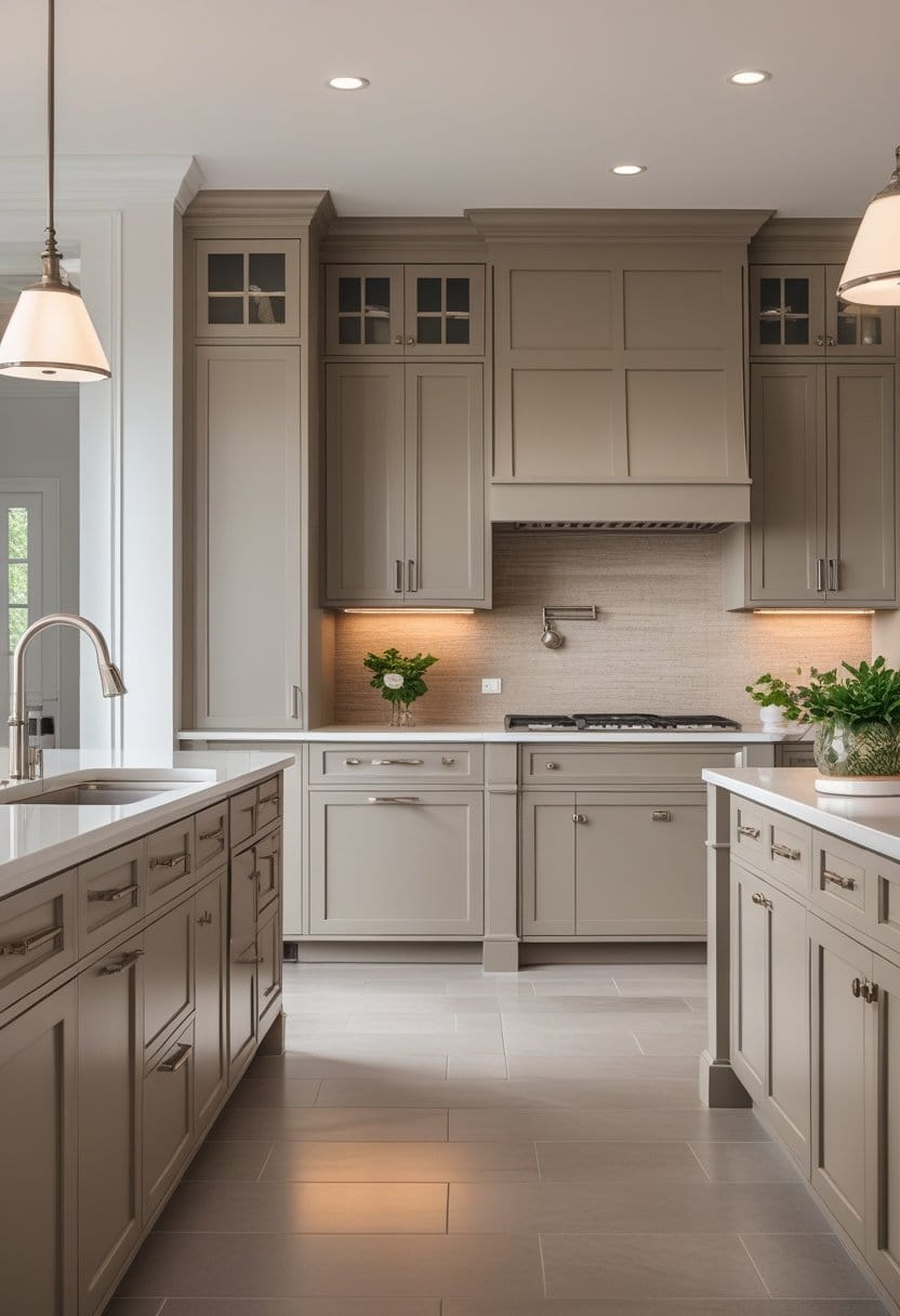
4) Greige for the Perfect Middle Ground
Greige (gray + beige) is one of the easiest cabinet colors to live with. It feels modern but still warm.
Best for: Open-plan homes, neutral lovers, resale-friendly updates
Pairs well with:
- Warm wood accents
- Soft white walls
- Black or bronze hardware
Quick tip: If you can’t decide between gray and beige, greige is often the safest choice.
5) Charcoal for a Bold, High-End Statement
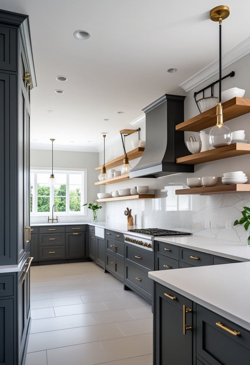
Charcoal cabinets feel rich and sophisticated without being as harsh as pure black. They add depth and hide minor marks better than light colors.
Best for: Larger kitchens, statement designs, modern styles
Pairs well with:
- White counters for contrast
- Warm wood shelves
- Gold or brushed brass pulls
Quick tip: Use strong lighting—dark cabinets look best when the kitchen is well-lit.
6) Matte Black for Modern Drama
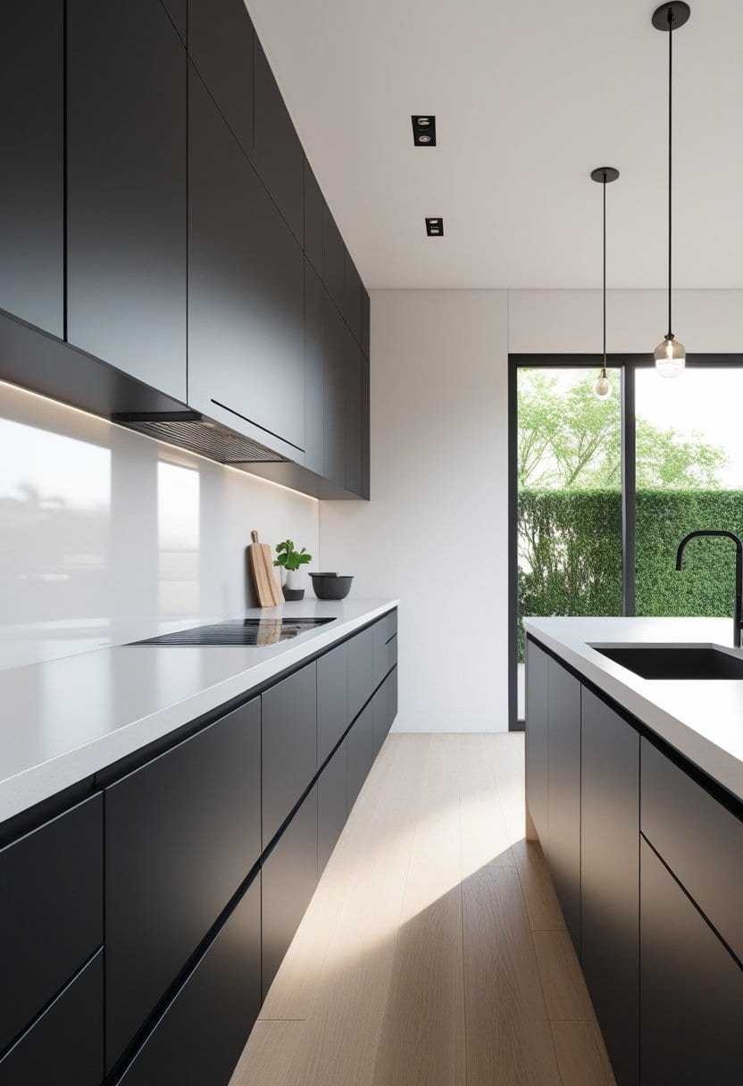
Black cabinets can look incredibly sleek, especially in a modern kitchen. They create strong contrast and make hardware and counters stand out.
Best for: Contemporary kitchens, bold design lovers
Pairs well with:
- White quartz counters
- Light wood flooring
- Minimalist hardware
Quick tip: Matte finishes can reduce the look of fingerprints compared to glossy black.
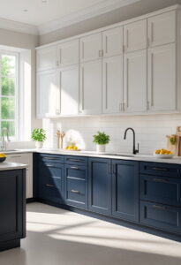
7) Navy Blue for Timeless Depth
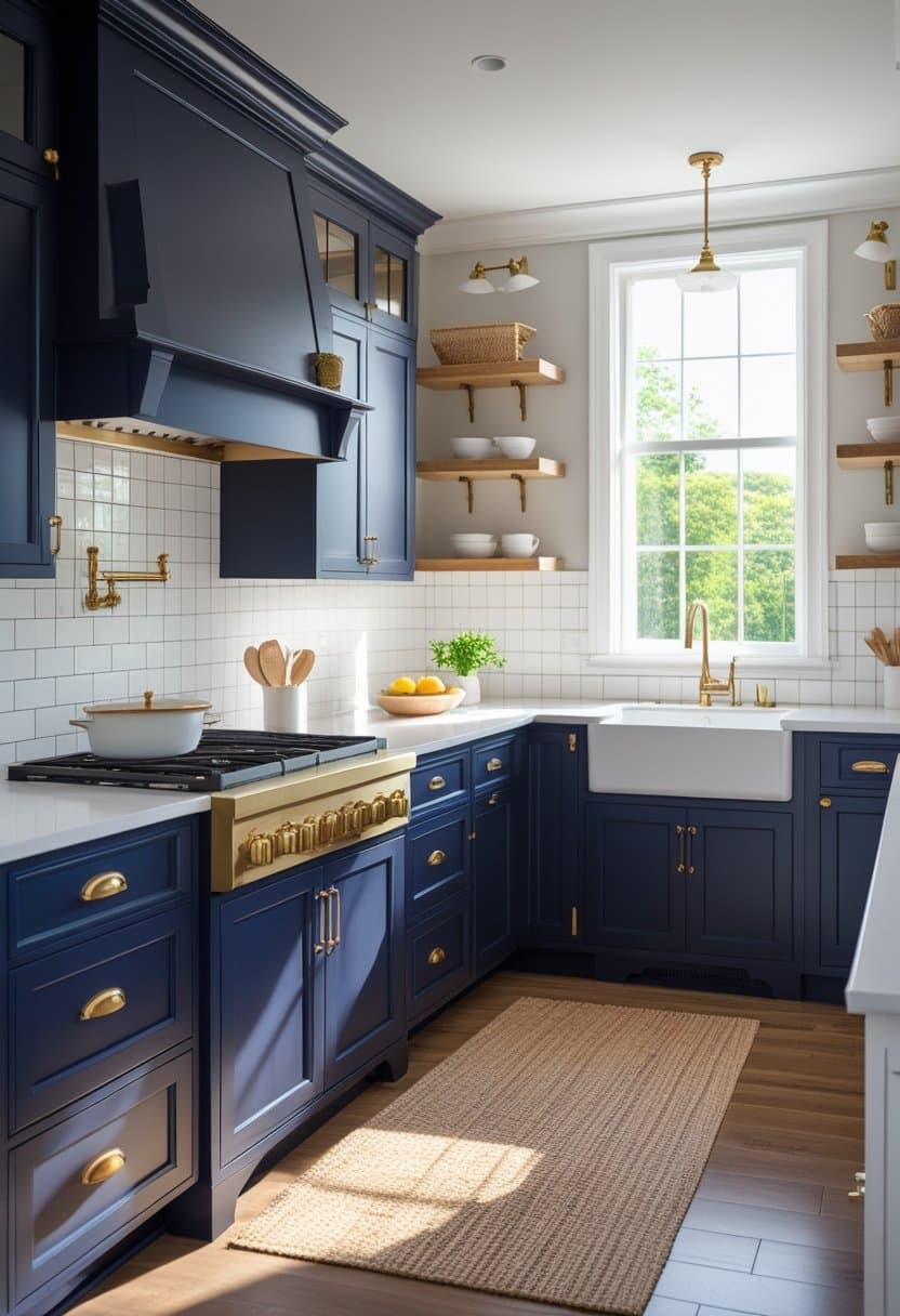
Navy is a classic “color with confidence.” It feels elegant and works beautifully with both modern and traditional kitchens.
Best for: Transitional kitchens, classic homes, coastal looks
Pairs well with:
- White counters and backsplash
- Brass hardware
- Natural wood accents
Quick tip: Navy looks especially good on lower cabinets with lighter uppers.
8) Slate Blue for a Softer, Trend-Resistant Look
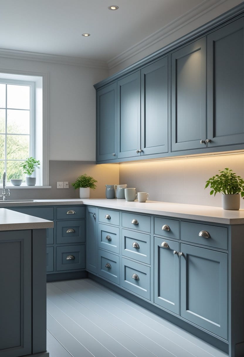
Slate blue gives you the richness of blue without being too bright. It feels calm, mature, and easy to match.
Best for: Calm kitchens, relaxed modern spaces
Pairs well with:
- Light gray or white counters
- Brushed nickel hardware
- Pale wood floors
Quick tip: If you want blue but fear it’s too bold, slate blue is a smart compromise.
9) Sage Green for a Natural, Fresh Vibe
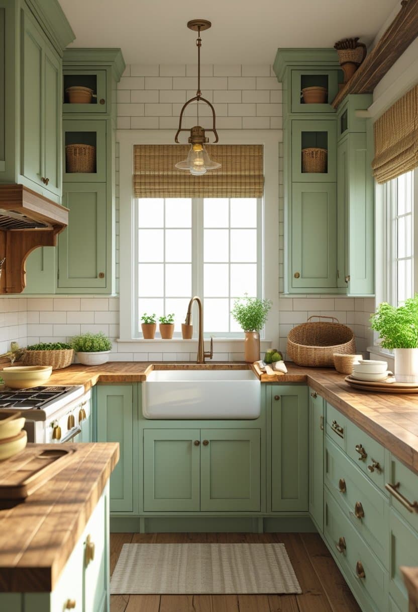
Sage is one of the most loved kitchen colors because it feels soft, earthy, and clean. It brings a “fresh air” feeling into the room.
Best for: Farmhouse, cottage, nature-inspired kitchens
Pairs well with:
- Butcher block counters
- White tile backsplash
- Bronze or brass hardware
Quick tip: Sage works well in both sunny and shaded kitchens because it is not too bright.
10) Olive Green for Warm, Earthy Character
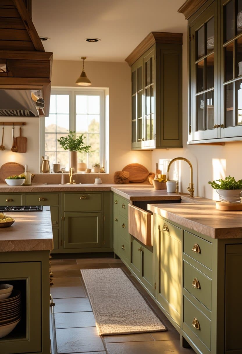
Olive green adds richness and feels grounded. It can look vintage, modern, or rustic depending on the finishes around it.
Best for: Warm, cozy kitchens; homes with lots of wood tones
Pairs well with:
- Cream walls
- Brass hardware
- Warm stone counters
Quick tip: Olive can appear darker in low light, so use under-cabinet lighting if needed.
11) Forest Green for a Luxurious, Classic Look
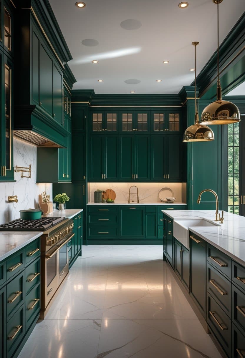
Forest green cabinets can feel premium and dramatic while still being connected to nature.
Best for: Statement kitchens, classic elegance
Pairs well with:
- White marble-look counters
- Gold hardware
- Dark wood accents
Quick tip: Consider forest green on an island to add a focal point without making the whole kitchen dark.
12) Soft Beige for Simple, Timeless Comfort
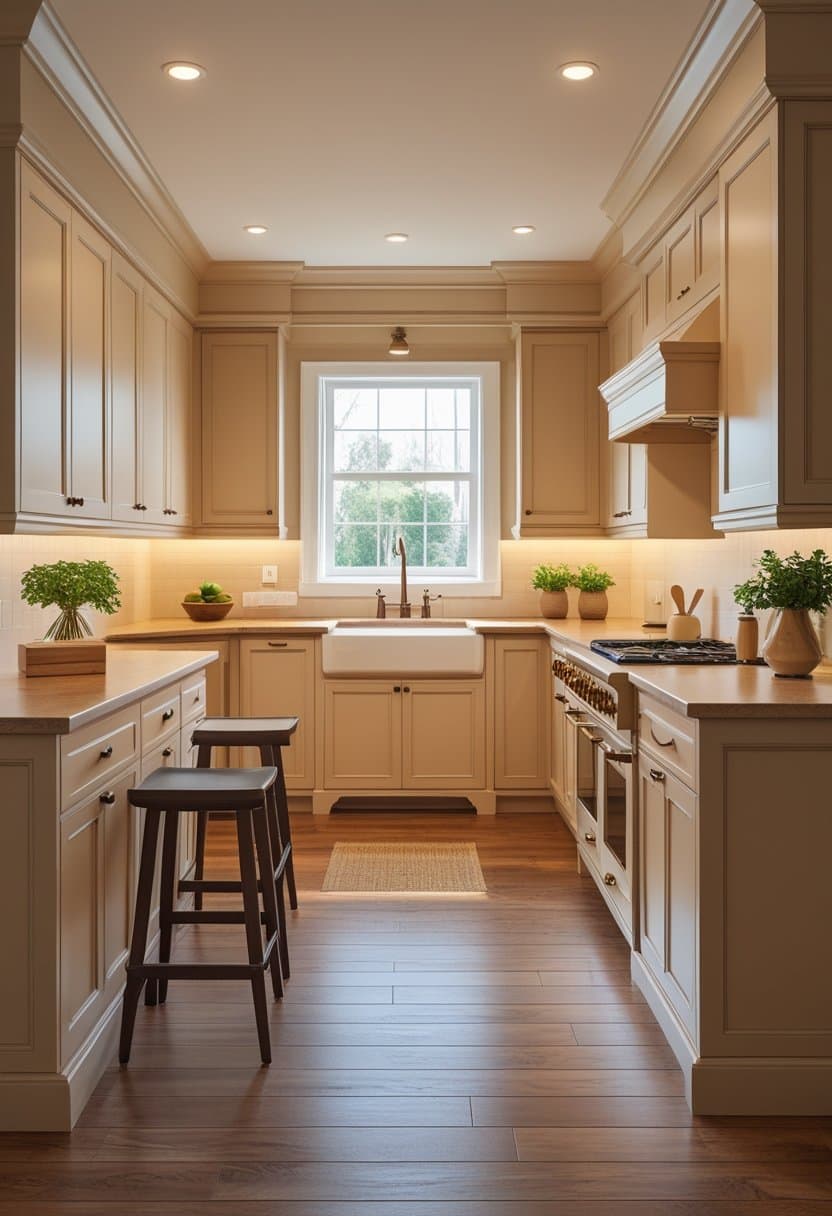
Beige cabinets are underrated. They create warmth and make a kitchen feel calm and welcoming.
Best for: Traditional homes, warm color palettes
Pairs well with:
- Warm white backsplash
- Wood floors
- Bronze hardware
Quick tip: Beige looks best with a bit of contrast—avoid matching every surface to the same beige tone.
13) Taupe for a Sophisticated Neutral
Taupe is deeper than beige and often feels more “designer.” It’s great when you want neutral cabinets with more personality.
Best for: Elegant kitchens, transitional styles
Pairs well with:
- White countertops
- Stone backsplash
- Brushed metal hardware
Quick tip: Taupe can lean warm or cool—sample first to match your floors and counters.
14) Pale Blue for an Airy, Relaxed Kitchen
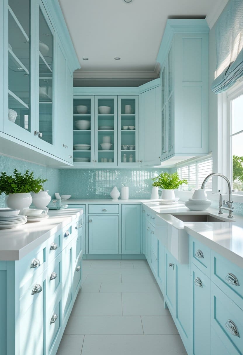
Pale blue feels light, cheerful, and clean. It’s a great choice when you want color without intensity.
Best for: Coastal kitchens, bright spaces
Pairs well with:
- White counters
- Glass tile backsplash
- Chrome or nickel hardware
Quick tip: Pale blue works well in kitchens that get plenty of natural light.
15) Dusty Rose for a Soft, Modern Twist
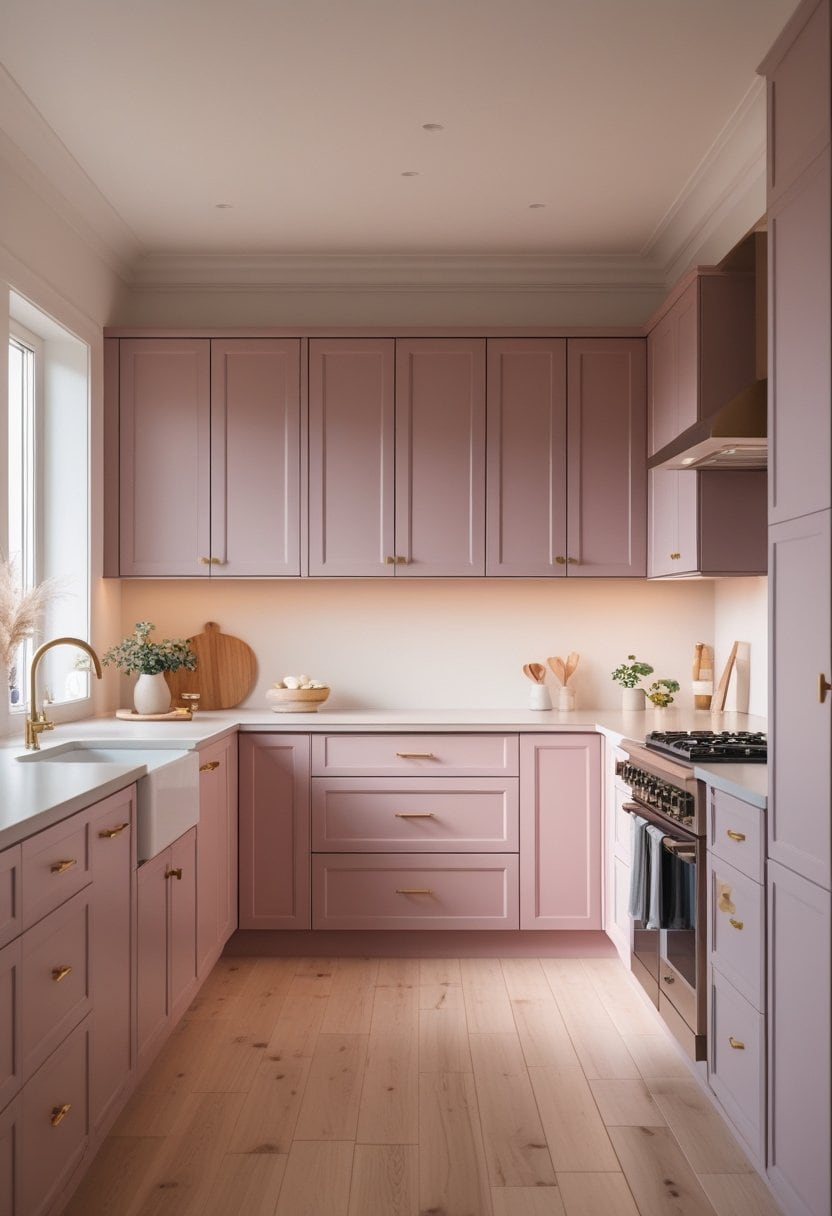
Dusty rose can look surprisingly grown-up when done correctly. It adds warmth and style without feeling loud.
Best for: Modern, creative homes
Pairs well with:
- Warm white walls
- Light wood floors
- Simple brass hardware
Quick tip: Keep counters and backsplash neutral so the cabinets feel intentional, not overwhelming.
16) Terracotta for Warmth and Personality
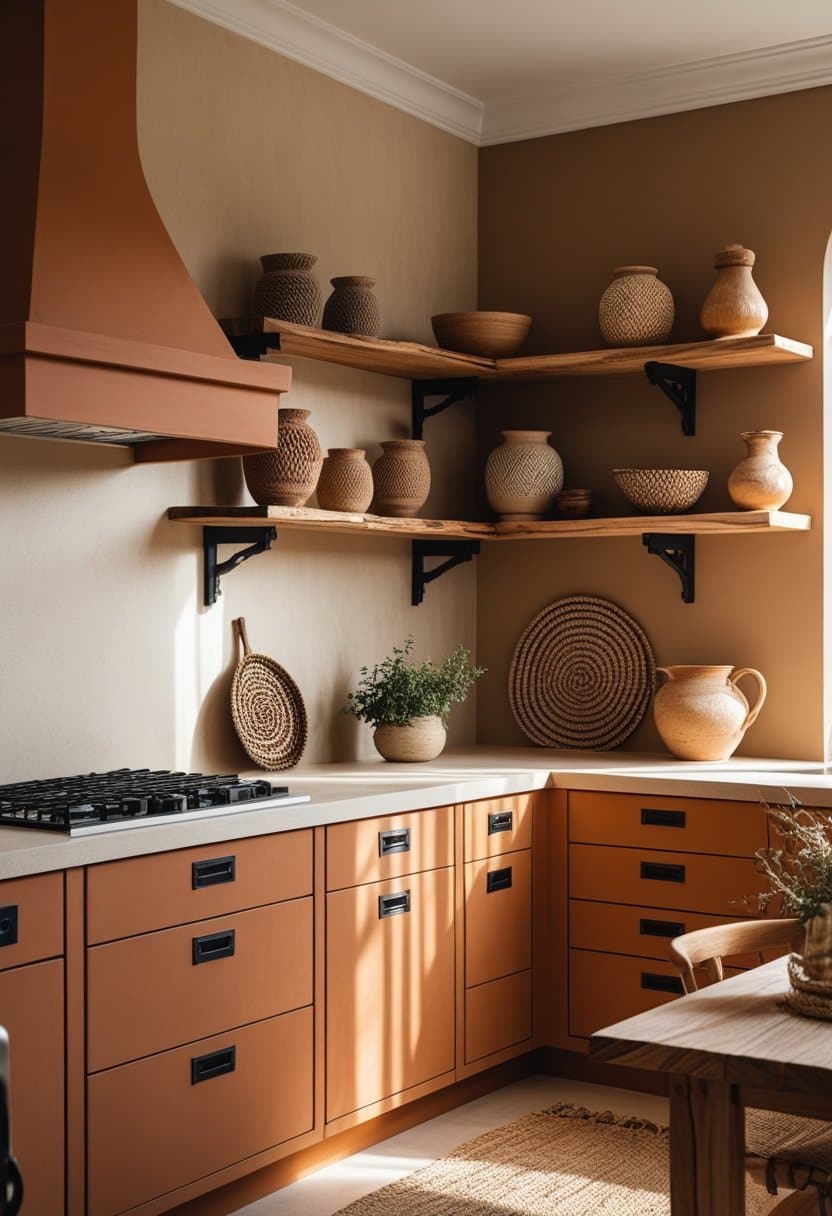
Terracotta cabinets bring earthy warmth and a unique look, especially in kitchens with natural textures.
Best for: Mediterranean, boho, rustic-modern kitchens
Pairs well with:
- Cream backsplash
- Natural wood shelves
- Black hardware for contrast
Quick tip: Terracotta looks best when other elements (like counters) are calm and simple.
17) Sunny Yellow for a Cheerful, Energizing Space
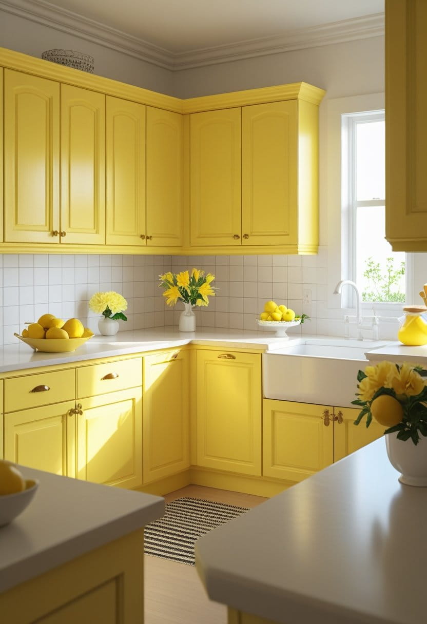
Yellow cabinets can brighten the mood instantly. Used the right way, they feel joyful and inviting.
Best for: Small kitchens needing energy, vintage-inspired looks
Pairs well with:
- White tile backsplash
- Light counters
- Simple hardware
Quick tip: Choose a softer yellow if you want a calmer feel; bold yellow makes a stronger statement.
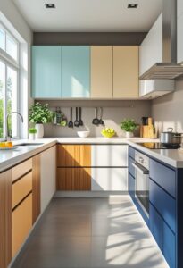
18) Two-Tone Cabinets for Depth and Balance
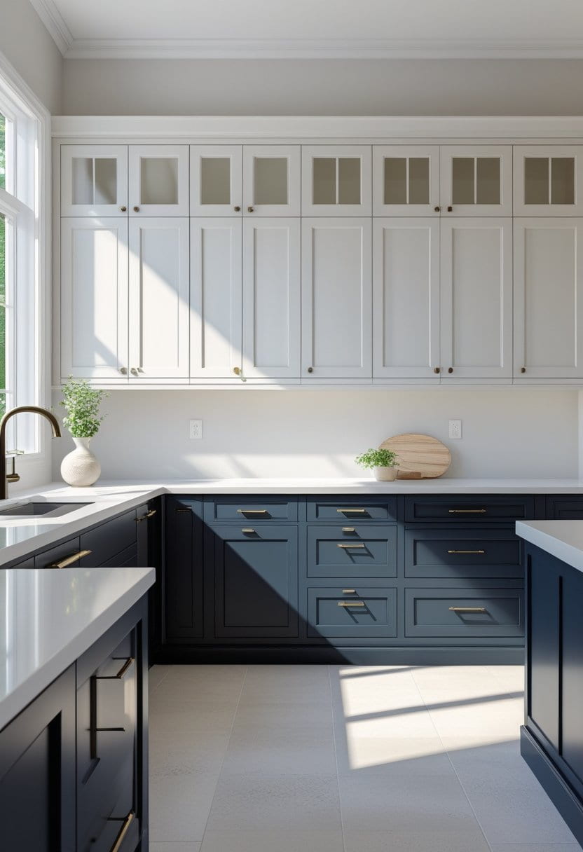
Two-tone cabinets are one of the smartest design choices because they add contrast without making the kitchen feel heavy.
Popular two-tone combinations:
- White uppers + navy lowers
- Cream uppers + forest green lowers
- Light gray uppers + charcoal lowers
Quick tip: If your kitchen is small, keep the upper cabinets lighter to avoid closing in the space.
19) Natural Wood Tones for Warm, Organic Style
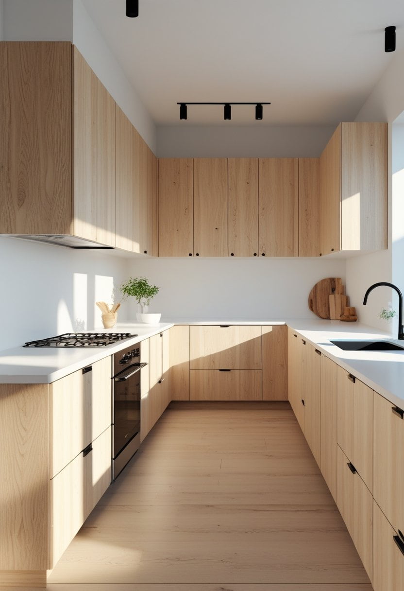
Not every “color” choice has to be paint. Natural wood cabinets are making a strong comeback because they feel authentic and timeless.
Best for: Warm modern kitchens, Scandinavian styles, organic design
Pairs well with:
- White or cream counters
- Simple backsplash
- Black hardware for a modern edge
Quick tip: If you want a fresh look, consider a lighter wood stain instead of dark, heavy tones.
20) Soft Black or “Off-Black” for a Softer Modern Look
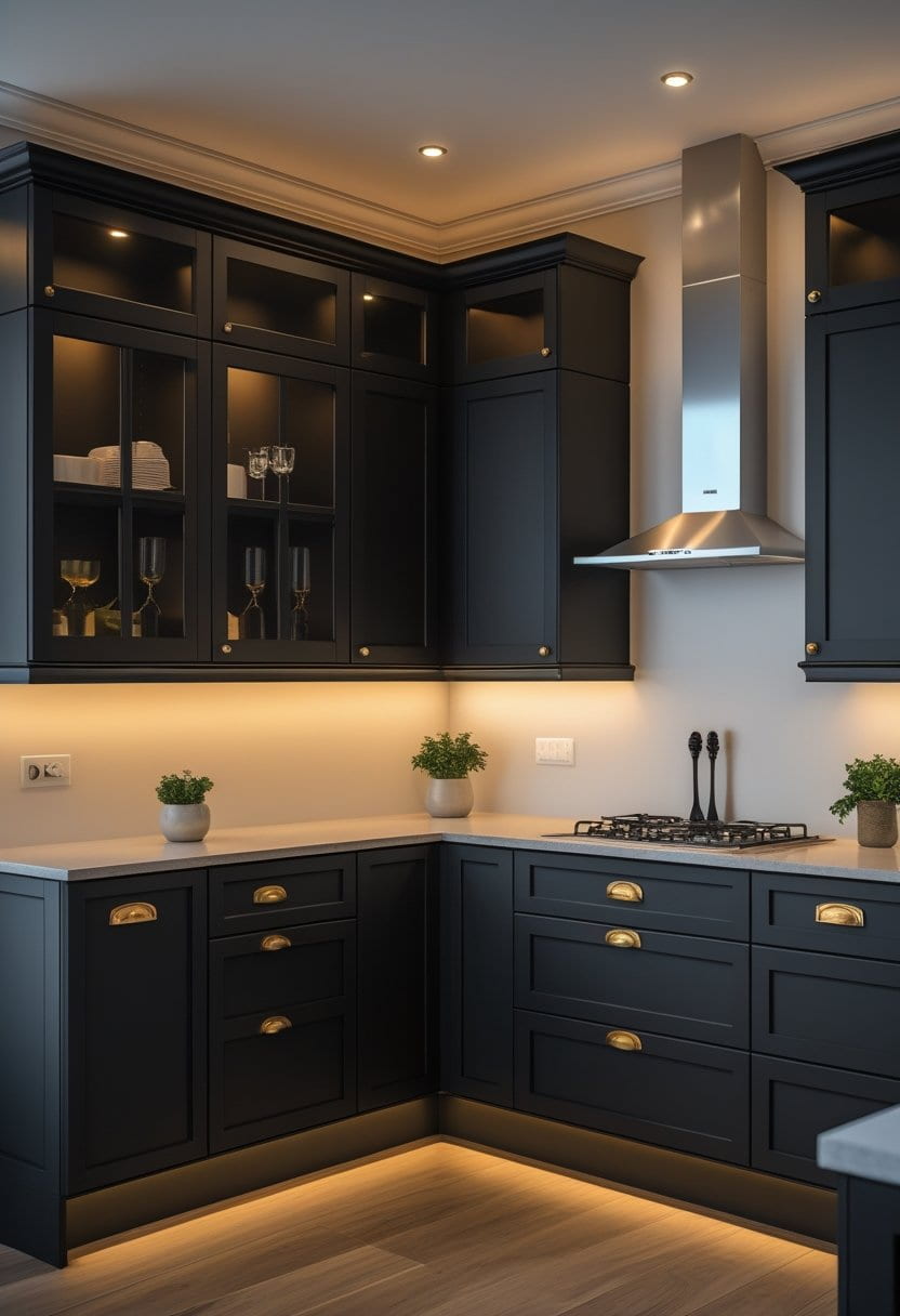
Off-black (like deep charcoal or black with warm undertones) gives you the boldness of black with a slightly softer feel.
Best for: Modern kitchens, open layouts, dramatic looks
Pairs well with:
- Warm white walls
- Light counters
- Brass or matte black hardware
Quick tip: Off-black often looks more inviting than pure black, especially in homes with warm lighting.
How to Choose the Right Cabinet Color Without Stress
Picking from these 20 kitchen cabinet color ideas for a fresh look gets easier when you follow a simple method.
Use this quick checklist:
- Check your lighting: Natural light and warm/cool bulbs change how paint looks.
- Match your fixed items: Counters, floors, and backsplash are harder to change than paint.
- Decide the mood: Bright and airy? Warm and cozy? Bold and modern?
- Use samples: View paint samples in morning, afternoon, and night lighting.
- Think about maintenance: Very glossy dark finishes show fingerprints more.
Simple rule:
- If your kitchen is small or dim, lean lighter.
- If your kitchen is large or well-lit, you can go darker and bolder.
Best Hardware Pairings That Make Colors Look Better
Hardware might seem minor, but it changes how cabinet color reads.
Fast pairing guide:
- White / cream cabinets: black, nickel, brass
- Gray / greige cabinets: chrome, nickel, matte black
- Navy / green cabinets: brass, gold, black
- Black / charcoal cabinets: brass, black, stainless
- Wood cabinets: black, bronze, brushed nickel
Tip: Keep hardware consistent throughout the kitchen for a cleaner, more professional look.
Common Mistakes to Avoid When Changing Cabinet Colors
A fresh cabinet color can go wrong if a few key steps are missed.
Avoid these common issues:
- Choosing a color without checking it in your kitchen lighting
- Ignoring the undertones of counters and flooring
- Picking a trendy shade that doesn’t fit your home’s overall style
- Using the wrong paint type or finish for cabinets
- Skipping proper prep, leading to peeling or uneven results
Best practice: Cabinets need durable finishes because they get touched daily.
Conclusion
Cabinet color is one of the most powerful ways to refresh your kitchen without changing the entire layout. Whether you choose classic white, calming sage, elegant navy, or bold charcoal, the key is matching the shade to your lighting, fixed surfaces, and the mood you want every day.
If you want the safest approach, start with timeless neutrals like white, cream, light gray, or greige. If you want a stronger transformation, consider richer options like navy, forest green, charcoal, or matte black. And if you want something truly unique, explore dusty rose, terracotta, or two-tone combinations.
With these 20 kitchen cabinet color ideas for a fresh look, you can pick a direction with confidence and create a kitchen that feels updated, welcoming, and personal.
More Stories
21 Bedroom Interior Ideas That Redefine Elegance
22 Japandi Dining Room Ideas for Minimalist Comfort
24 Modern Living Room Ideas for Contemporary Homes